Sketches
To help me with my designs for my final assets I have done sketches of each asset that I will be making in my scene and have done different designs, these designs are just of the structure shape and general feel for the assets. at the end of explaining what and why I have designed my assets like that I shall be evaluating myself and I shall be choosing a design that I shall be doing and creating in my final product.
Shotgun

Here I have my first sketch for my shotgun. This is a short pump action shotgun, here I have applied a magazine so that the shotgun as the effect of seeming a little more modern, I imagine the stock would be made out of oak hard wood with a gloss effect , the magazine would be a rough steel, with a black base colour with a little shy, a flake effect would be placed onto the magazine as well to make it look realistic, the shotgun barrel would be a dark grey or a light grey colour, this would have a smooth barrel end, as shotguns are close quarter combat weapons and would therefore not need to be rifled, this would be a good model to use as its not only realistic but in my opinion its well designed, I am aware that I would have to have a safety flip on the side of the trigger to make the weapon look even more realistic. The weapon also have a dip in the side where is where the shotgun shells would have been pushed out after firing.

Here I have my short pump action shotgun. This design has no sights on the top making it seem to the user that this would be used for defense and not for attacking someone. There is a safety flip on the side of the weapon. I imagine the stock to be a dark wood as it would be quite rough and the fibers to be standing out a little. The magazine is slightly curved as I tried to make to magazine small so the shotgun didn’t seem to have a huge magazine or a combat shotgun type magazine. I have added a hand grip on the end which I would imagine that it would be made out of soft wood, which would be the same as the wood of the stock so that those two pieces match each other very well, I believe that the magazine as well as the barrel would be a very similar texture as the first sketch as well as the trigger and the trigger bracket with the weapon.

Here I have my Single barrel shotgun with an extended barrel as well as a small sight at the end. the sight implies that this weapon would be used to hunt with and not really for defense. This shotgun would be used at close range and it would be a single shot weapon, this makes it impractical against multiple people and would be impractical for big fights, this weapon would be impractical which is why I think it would be good for my scene as it allows the viewer to think deep and come to the conclusion that the weapon might have been used in desperation cause its all they had.

Here I have my final design for my shotgun asset for my environment scenes, I have sketched this design to be a sawn off shotgun, I have done this so that this design stand quite far out compared to the others I have made. This design is quite impractical for usage but is a totally viable weapon, this weapon would have a single shot magazine making it impractical but I feel as if this design could work very well in my second scene as it wold show desperation behind the user using it which I also belie works very well into my theme. While this design is very minimalist one textured I hope to make this weapon look pieced together to enhance the look of desperation within the weapon as well
Evaluation
Looking back upon these sketches I have determined that the short pump action shotgun with the small sights and magazine (Sketch 2) if the design I am gong to go for when creating this asset for my project. I have chosen this design as I believe it gives off a very distinct feel of violence and terror withing the object being there, but with the object now abandoned and left laying on the floor it make the scene feel very abandoned and gives the viewer an uneasy feeling when looking at my scene. I have also chosen this design to be my final design as I would be able to model and texture this asset to look as if it was modified perhaps in desperation to survive from something or so that the weapon would be very applicable to the viewer.
Milk Container Designs

Here I have my first design for the milk assets in my scene. This sketch of of a milk bottle which is traditionally placed at the front of the house by the local milk man, however you can get this bottle in store and but them off the shelf. this bottle would be made out glass and it would be modeled so it would be smooth curves around the bottle. This asset would have a red bottle top which would be made out of metal such as tin, it would there for have a little shine and possible a small logo on the top, I could as well used the same asset with a different colour lid to show the variants of milk which use the same bottle. this I think would be a simple yet an effective piece to use in my scenes.

Here I have made a sketch based off of a milk carton, I have used my primary research to help me draw this sketch, while the sketch is basic and very 2D it does clearly show the design of the asset as well as the positions of the edges and the lid compared to the rest of this piece. I believe I could use the same model and unwrap but create a small number of designs which would have different colours to show the different types of milk. much like the first design I believe I could make this very well, its a simple mesh, however with a good texture I believe this model would look very good would make the environment look more realistic as it would show the variants of products on the shelves like we do in the real world.

Here I have my third design for my milk assets for my environment scene. in this sketch I have sketched a milk jug which People find and use mostly, they are in almost every supermarket and corner shop. This is the most commonly used container for milk, these are fairly easy to model, the texture for this asset would also be fairly easy to use and I have the option as well to use the texturing application to show the variants of milk that would be available to be used in the shop therefore making it a viable design that I could use in my final product scenes.
Evaluation
For this asset I had three total design, because of this I evaluated each design in terms of modeling, how I could get it to look as the finished product and the placements in my environment scene. After much evaluating all my design I came to the conclusion of using the first and second design. I didn’t choose the third design as I would have to model all the effects for the milk jug and have to create the label, however I thought three designs for one asset which would have the same variance (such as colours for milk types and lids) as the other designs which I thought was unnecessary, because of this I decided to go for the milk carton and the bilk bottle as it is the same asset in two different designs with two completely different textures so while they may look the say, they would look totally different as I thought the milk jug was sort of the in-between of these assets, removing that made the assets seems very different compared to each other. I chose the first design as I wanted to give the shop a rural feeling to it, selling whatever products I can sell to its customs, making the impression seem like this shop isn’t very popular or perhaps has a very low customer market.
Soft Drink Cans

Here I have created my sketch over the short soft drinks can, from this sketch I can see the effects of the object such as where the dip is at the top of the asset as well as the base off the asset and see the object scaled in slightly before moving further downwards., from this I can also see where the curve is nearing the top of the asset as well. this will be helpful for me when I create my version of this asset as it will allow me to model the effect that the object has as well as making the object realistic it will also help me create the object to scale.

Here i have sketched out my version of the tall soft drink can I hope to put into my scene, overall this sketch wasn’t that different from the first sketch I did for the soft drink can asset, however I believe that once this asset has been modeled and textured it will look different compared to the first design, not only for its notable extra height but also from the texture applied to this asset in the final product.

Here I have sketched out my tall think soft dink can, I have sketched this because I believe based upon my research that I have done, I believe that this asset will stand out quite a bit compared to the other two variants as I believe this will have a good texture to it showing that my environment scene shop has a wider selection of products that they sell as well making the scene overall a little bit more compact and busier and therefore making the scene look and feel a little more realistic.
Evaluation
For these sketches I cant really choose a final design, because all of these sketches all have their own merits and I could indeed use these very well. Because of this I have decided to use all three designs for my final product scene to not only help me increase my shops products for sale but to also show the variance with the models as well as the textures because the designs are so similar yet so different I can more of less model all of these assets at the same time with small changes to the mesh making it an easy assets to model the variants off as well as texture each design with a few different textures to really expands the products in my scene.
Outside Sign

Here I have my first sketch for the sign that will go outside my shop. I believe this asset will work wonders in helping my scenes to be realistic as well as detailed, this asset would be placed just in front of the doorway to the shop, this asset would have a logo or perhaps a slogan on the front, it would advertise that the shop is open for business. The panel would be held to the base by a pole extending around the sign and back into the base at the other side with the panel on a hinge so that it can swing in the wind. This base is formed off of a brick which means that it would be hard for the wind to blow and knock over the sign as well as it would allow the poles to be attached to the base, the base would be made off rough dark texture with a high level of roughness and a black base colour to try and make it look like its made out of plastic or perhaps even rubber.

Here I have my second design for the outside sign for my environment scene. This asset I have designed a little bit differently compared to my first design. The first difference is that the panel for this asset would be held to the infrastructure by a small number of chains. This would mean I would have to Boolean a hole into the panel and model chains to fit into the hole and position them so that the chains look like they are holding the panel in place, this would allow me to show how much attention to detail that I have put into my environment pieces but also to show that the shop is quite cheap, they don’t have the money to buy a panel sign fr their show giving the impression thats he shop is not very popular and perhaps rural.
Evaluation
The outside signs in the end were an easy choice for me, as my first design has is hinges on so it would allow the panel to swing easily in the wind. However the second design has a better base as it would allow the sign to look much more curved and practical to use, the chains can connect the panel to the holding brackets easily and would allow me to place my chain links so that it looks like the sign is really handing from the brackets and would allow me to create a really good detailed piece for me to model and texture for my final scene to make the final product look really good in my environment.
Shop Door

Here I have sketched out my first design for the doorway and door for my environment scene, this door way consists of a metal door frames which I can image being painted and bulging slightly from the wall of the building, the door would have a small gap between the door and the door frame, the door would be quite thick just as the door way is, the handle would be curved and cylindrical, I image this would have a simple texture of metal and the handle to be smooth for the user which would also make the environment scene look even more realistic to the viewer. There would be a thick glass pane in the middle which would be the same on the top an the bottom. This gives the effect that the door is fairly basic and simple, this makes the viewer think that the shop isn’t that popular or have a lot of money to spare to make the shop nice for the customers.

Here I have my second design for my shop door for my environment scene, this design differs from my first design, this design is designed so it look and feels much more like a home door, a door with a little style to it to give the customers coming in and exiting the shop a little more enjoyment in their time there. The top window differs as it would have a wooden cross going across the window pain, the door would be made out of wood with wooden planks going vertical across the whole door. The hinges and door handle would be a golden colour as I believe it would be made out of brass to make the door seem realistic, and the door will have a cylindrical handle going outwards on both sides of the door allowing it to be a push and a pull door.
Evaluation
For this asset the choice was quite difficult, I had to think of the messages that the door might send to the viewer as well as the colour choices I was thinking that I could possibly use for this asset. However eventually I came to the conclusion of using the first design, I have chosen this design because this design is much more simple. I also chose this design as I believe that this design would give the impression to the viewer that the shop is not very rich, perhaps the shop is barely scraping by as its quite a basic and a thick door. I also believe that the handle is much nicer to use and would be easier to use by the general public than the door handle which could be used vertically as well as horizontally, I could also make this door a push and a pull door so it would work both ways.
Inside Sign

Here I have made my first design for my inside hanging product sign, I have taken inspiration of this sign from the signs inside supermarkets such as “Morrisons”, “Tesco”, “Waitrose” etc. These signs often hang from two thin wires that are then tied to the sign so that the sign hangs easily. The design allows the sign to lift a long list of products that may be sold, because my shop would be so much smaller I have used one side with a flat edge. I would be able to use one side of the sign to lift the products as well as model it so clearly outline where this writing would be, I would be able to mold my geometry so that it fits the wording helping me with my texturing as I can use the geometry fill tool in substance painter and then delete the unnecessary edges at a later date to save myself a lot of polys and lower my overall poly count. Overall I really like this design as not only is it simple in shape and structure it is also very well designed as the sign is not to cramped up together but it is also not to far away so that the design is to open it makes the asset look a little pointless.

Here I have create my second design for my inside product sign asset for my scenes. this design is very different from my other scenes. This design is designed to that the top segment hangs from the ceiling, these would hang from two thin wires that are then tied to the sign so that the sign hangs easily while being stable. The sections underneath would all be joined in the same way connecting to the one on top which would have the product names on the front. making the texturing for this asset would be quite useful as I would be able to mold my geometry so that it fits the wording helping me with my texturing as I can use the geometry fill tool in substance painter and then delete the unnecessary edges at a later date to save myself a lot of polys and lower my overall poly count which saves space and still gives me a perfect result. I quite like this design as it allows me to get creative with the colour coordination as well as the placement of each work that would go into this asset.
Evaluation
Over much consideration as well as scanning over the sketches that I have made and considering about what I could do with this object to fit in with my scene the best as I could do, I have concluded that my first design is the best choice to fit into my scene as this design is fairly simple and I think would requite a lot less polys to create which means that I can spend more time texturing than modeling to make sure that this asset looks good ready for my final scene. I have also chosen this design because I believe it is more visually appealing for the viewer to look at, the layout of this asset is quite simple so it makes it much easier for the viewer to read ad understand.
Cash Register

Here I have sketched out my first design for my cash register which will go into my scenes. With this design I have designed the tray to slide in and out from the base with a key port at the end which would make the viewer think that this shop was secure with its money or perhaps over protective with what little they had. The top of the cash register is placed with buttons, on the left hand side I have the 12 buttons for the numbers with a dot and and enter button, the buttons just to the left of these will have text textured on them giving the viewer the feel as if this was a real cash register and has been used quite a bit. On the top right hand side we have the screen where the customer would see the amount due when they had to pay for their goods, this would be extruded in slightly to give the effect that this component has some sort of protective casing. There is a selection of buttons on the right hand side, these could be coloured and modeled so that the keys look realistic to the cash register and I would make sure to colour coordinate these keys so that they look like they have similar functions. The top of the cash register would be curved especially where the receipt packet is as I would be sure to model this effect so that when textures the cash register will look as good as it can possible be.

Here I have my second design for my cash register. Here I have designed this to be much simpler than my first design. The cash tray is very much the same except that the individual trays are length ways with a few squares at the side as this would give the effect that they kept notes in the cash register and were quite orderly about handling their money. This design does not have the head up screen for the price for the customer to see from, this gives the impression that this was perhaps a quite low budget cash register which would also explain the lack of buttons especially compared top my first design.This design follows with the receipt packet at the left hand side with a rising curve the further back along the shape you go.
Evaluation
Overall I really like both designs for my cash register and I would love to do both as they have their strengths as well as the implications from the design itself. However after pondering and evaluating these two designs I have decided to got for my second design as this would allow me to model less effect and buttons but would also allow me to create the feeling that this design gives and fit it into my scene, more than my first design I believe.
Stop Sign

Here I have sketched out a stop signs which I have base upon my research that I have done for this asset, this first design I do not much like. I feel as if this design is unnecessarily to much like an 8 big game asset, I feel as if this deigns would need to be much rounder so that the asset looks better and is easier on the users eyes. I also feel as if the sign is far to simple, I feel that the poll that the sign is attached to needs to have some sort of design at the base to make this asset not only look good but also realistic. The sign would have some characterization of it, the wring for example would be textured onto my page with a black outline to clearly show the letters, the sign would also be very reflective as people would need to see this sign in the night, the outside of the sign would have a thick white barrier so that the sign can stand out easily especially in the dark as the colour white is most reflective, this would make the sign look more at home in my environment scene as well as more realistic for my project.

Here I have sketched a more rounded stop sign. I really like this design as it is more circular. This design seems much more appealing to the viewer and would be more detailed, the sign would be bolted through the main pole to the sign, I would think that the sign would have a small hexagon pattern to it with certain more rough than other sections to make the asset look even more realistic. The asset would have a thick white outline going around the sign as it would make the sign stand out and seem much more practical if the asset was being used like it was in real life.
Evaluation
Overall for this asset the choice for my final design choice was easy. As I don’t like the first design as I feel like the sign is to low poly and a bit to basic I feel like my rounded design (Sketch 2) would be much more realistic to put into my scene but would also make the area seem a little more civilized to show that this could have been a busy road at times. From this sketch as well I can create my own base for is asset so it fits onto the pathway quite well as well as the fact that in my opinion at least the asset is much easier on the eyes for the viewer to look at.
Shotgun Shells
This is my first idea for my shot gun shell asset which would be placed in my second environment scene. I was struggling for ideas so I went back to my research and found this design, this design is almost all one material, the texture for this would be a slightly dull brass texture when could have the base of the shotgun shell pressure point at the base, the top casing would be non existent as the shell and casing have been used, this would also have a small bulge at the base of the shell from where it would be pushed into place inside the weapon.

This is my second design for my shotgun shell for my environment scenes. Over all I think that the design of this is much better as it adds a bit of colour and detail to this asset, the bottom has a little dip around the pressure plate, the casing around the shell is coloured which I believe adds a little colour to the asset to make it look better and a little more stylized, this design also has a slight bulge at the base to make the asset realistic so it can look like it has been used with the weapon.
Evaluation
For this asset, the choice for my final design was easy, I chose my second design as it has a little colour as well as I could add detail such as writing to the base of the asset, the texture would be somewhat easy and from that I could create my own texture for the coloured segment of my shotgun shell and I could as well add a variety of colours or find a colour that perhaps give a faint yet unwavering apocalypse feel as if it was used in desperation or was broken in the process.
Colour/Texture ideas
Here I have put my chosen sketch for my final design choice and put that image into Photoshop, here I have coloured and drawn over the sketches to create a number of colour ideas and texture ideas for each of the titled assets. Here I have been sure to pay close attention to detail and if the colour coordination works well. I have also done an evaluation based upon each asset with what colour idea I will do when pieces together the final product.


To get my images into Photoshop I had to find out what resolution my phone camera has taken the images of my sketches in. To fit this image I had to go into Photoshop after I had imported one image in from this I was able to get the resolution in pixels, this allowed me to create new files in the exact same size so I will not have any white or clear space on my files which also means that I could go into detail with my colour and texture ideas with the assets I need to explore the textures upon. Because of my sketches have been taken in different rotations because my hones saved them that way, I have to make sure all my sketches are the correct way before I can start the colour ideas for my assets, Photoshop has once again helped me quite a bit with this problem because in Image < Image Rotation has a range of command that I can give Photoshop to edit my image and allow me to easily navigate my way to making sure that the sketch is the correct way up.
Shotgun

Here I have my first colour idea for my shotgun asset, For this asset I have tried to texture the stock to be a dark shade of soak wood, this would be polishes so that it looked smooth in my final scene, have also textured the pump component to be the same as the user would keep their hands on this to have the weapon at the ready to use. I have textured the magazine to be a quite dark shade of grey with white outline to represent the height in the pattern of this asset. I have made sure that the barrel as well as the main body of the weapon is the same colour as these two components would almost certainly be made out of the same material with the pump bar being slightly darker to show that the shotgun has been used quite ab bit and perhaps the pump bar is quite worn.

Here I have tried to use this colour to make the weapon look as if it has been crafted, perhaps welded together, I have textured the magazine to be a dark shade of black with a grey outline to show a pattern on the side of this component, this would be an indent inwards with a smooth curve so that my model looks good. I have also once again made sure to texture the main body of the weapon and the barrel the same as these would be made together but I have made sire to texture the trigger bracket to be a light shade of grey as this would show its not an original component showing its been modified or crafted, I would also use height to make it seem as if the the pieces were crafted together, I have added a black curve at the end of the pump components as this could perhaps be reinforced metal with a wooden support structure to help the weapon be practical and be structurally stable. I have made sure the excess shotgun shell slop is a lighter shade of grey as this helps it not only stand out but also gives the impression that this weapon is not original. Overall I really like this design as it gives the feeling that this weapon was made out desperation of a need, perhaps to kill, perhaps for money or drugs, or perhaps to survive.

Here I have tried to make this weapon look as if this design is official, as if this gun was made in a factory and then found by someone before being left in my scene. To make this seems appropriate I choose a grey colour to colour the body and the barrel component, and then used similar shades so I could show the variance in colour while not changing the colour to much so that the colour design looked bad., I did make the bottom of the magazine to be a dark shade of black as this would show when someone had to reload the weapon which side was the bottom and which was the top making it easy if the magazines were kept on their side. I have textured the stock as well as the pump component to be a somewhat dark shard of oak wood as this would allow the gun to be realistic as well. The trigger bracket I have been sure to texture in a darker shade of grey as this component could have been damaged and worn off by extensive use or perhaps this is an add on to the weapon.
Evaluation
Overall these design all have the feeling they would create in the viewer when they look at my scene. all of these designs would be realistic and totally plausible with my scenes and I believe that these would fit in rater well. after much consideration over these three designs and reading over my annotations I have decided that design 2 is the best design for this asset to fit into my scene. I have chosen this design as I feel as if this design shows the desperation that would be in people as the world was ending and would show possibly what people did when they resorted to violence, weather it was to kill, to gain something or even just to survive.
Shotgun Shell

Here I have my first colour design for my shotgun shell asset, for this design I decided to go with base colour, this texture would be a somewhat dull but still reflective brass like material which would have a faint grain effect of a darker shade of the same colour as well as the inside of the shotgun shell being the same texture. I could texture this asset with alphas as I could use height to create the effect as if its been embedded with the details of the cartridge on the bottom to make the shells seem more realistic. This design would have a curved extrusion so that the base of the shotgun shell would roll with a little bit of height.

This is my second colour idea for my shotgun shell asset. from first looks I much prefer this as I feel as if this design is not only much more interesting to look at but also as the design of the shotgun shell, it makes the asset seems much more professional as if it was crafted from a person, not a machine. This design is using the same brass like material as my first design, this would have a grainy effect with a similar shade of the material to initiate some difference in my asset, but there would also be a small curve as it came to the top of the asset which would be textured to look like velvet or some material of cloth that that would be going around the asset, this makes the asset overall more realistic and makes the asset have at least a small degree of style to it. I could very well have different colours but I have chosen this dark shade of red as this is a similar colour as per the shells from my research so to keep my assets to look as good as possible I shall be using a similar shade when texturing my asset.

Here I have my third and final design for my shotgun shell asset. Overall I really don’t like this design as I feel that this design is very dull but also now that I have drawn it I can see that it doesn’t look all that good or realistic. This design would be made out of a chrome or zinc type material. The meta would be made out of the same base colour but would be textured to look as if the metal was pretty dull but a somewhat shiny silver and for effects this would have a fiber map which would have two different shades of the same silver base colour around the shape to show how the asset was made and to give it some effects and to enhance the look of the asset. this would also have alphas used on the bottom of this asset using height as it would create the effect as if this asset was real and the viewer was looking at a real image.
Evaluation
Looking back upon my three colour ideas that I have created the choice was simple. I have decided to follow me second design for this asset. I believe that for this asset my second design is the best because, unlike my first and third design it allows me to add some effects to this asset to make the asset look really but it also follows my research and allows me to push myself a little with this asset to make it look realistic. I could create the metal component as well as the fiber components and be able to make them look good ready for my final scene as well as I would be able to create the effect as if the bottom of this asset is embedded with text using alphas with height which would allow me to enhance the realism of this asset and give it the best possible look.
Milk Products:
Milk Bottle
Lower Lable


Here I have my first overall design for my milk bottle. In this colour Idea I created a label going around the bottle that is around the center of the object as a whole. I have chosen the colours blue, red and green as these are the most common colours for the types of milk that are sold, yes there are yellow and purple milk but I decided to go with the three most common colours for milk. To create the effect of milk I textured the rest of the bottle to be a beige/white colour as the bottle would be transparent.
Milk Bottle Tops


For this set of colour ideas I decided to show the type of milk by the colour of the bottle caps, this is a good choice to use as it’s how early morning milkmen distinguish the types of milk for each house. This would also mean that I would not have to spend extra time texturing on a label onto my milk bottle asset and simple use a number for the setting of milk and the base colour on the bottle cap. I have chosen the colours blue, red and green as these are the most common colours for the types of milk that are sold, there are other types of milk such as yellow and purple milk but I decided to go with the three most common colours for milk.
Upper Lable


Here I have created my final set of texture ideas for my milk bottle asset. For this asset I decided to create a much smaller label going around the slop nearing the top of the object. For the label I have chosen the colours blue, red and green as these are the most common colours for the types of milk that are sold, yes there are yellow and purple milk but I decided to go with the three most common colours for milk. With this it would not mean I would have to create a full label for this asset but instead texture the label onto the model and then use an alpha to say “Semi-Skimmed, Skimmed” or “Full Fat” on the side to show to the customer what type of milk is stored into that bottle.
Evaluation
Looking back at these three Ideas I really like my third set of designs as this would allow me to create my asset and texture it simply with enough detail to make the asset look as if its a real asset. However after pondering and evaluating each of these designs as well as thinking about how I would model this asset as well as how I would texture it my second set of designs as this design would mean that I could texture this asset easily as well as add distinctive Features so that the asset will also look good as well as have enough information to make the asset same like it would make sense in real life.
Milk Carton
Upper Lable


Here I have my first colour variant for my milk carton asset. For this asset I have split the top of the asset into segments and have filled them in with the appropriate colour for the different types of milk available, this would clearly allowed the viewer as well as customers of the store to easily see their desired product and be bale to pick it up without having to look carefully to make sure they have the correct kind of product. Overall while this design may be very basic is is very visually relaxing as well as clearly being effect for consumers and store staff, of course I would still texture this asset to have a full carton texture to make sure that the asset looks good.
Milk Carton Flap


Here I have created my second set of variants for my milk carton asset. For this design I have tried to make the very top flap to symbolise the colour which would determine the type of milk that the carton contains. Overall I feel as if this set of designs is far to simple, as well as I think that the colour is not large enough for the viewer of customer not notice the type of milk contained withing immediately, I feel as if this symbolism for this asset needs to be bigger or in a much more important place for this asset.
Milk Carton Carton Lid


Here I have my third and final set of colour ideas for my milk carton asset. For this design I through about my second design and I decided “what better and more important component is there on a milk carton than the carton lid as you need to use it to open the container an get to its contents” because of this thought I thought it would be a very good idea to use the carton lid as the way that the viewer and the customer can differentiate the cartons for the different types of milk being sold. However after completing these design I was left, rather blank. I was well aware that the carton would seem somewhat bare, but I feel as if this design wasn’t not effect at all, the shading and colour segment is so small it doesn’t really make much of a difference to the carton as a whole.
Evaluation
Overall looking at these designs it wasn’t hard for me to make a decision. As I think the second and third design is far to minimal I have decided to use my first design. I believe this is the best design as this design is easily distinguishable from the cartons of other variants and would allow me enough space on the rest of this model that I could easily create such effects such as a bar code and the text needed for this asset to make this asset seem even more realistic to the viewer.
Soft Drink Cans:
Normal Soft Drink Can
Here I have created a few different colour ideas for for normal soft drink can, as I wasn’t completely sure what I wanted for A design I decided to use basic colour to help me sort this out, I decided to look at my research as I noticed that the colour of the can helps the same can stand out for the flavor of the contents inside, for this I have decided that the base colour will help me with the colors and from there I can try to create a design in my texturing.

Here I started off with a traditional Orangeade soft drink and decided to look at 3 different companies to see how the colour pallet varies, after comparing them I tried to find a colour which I not only likes but also thought was well suited to the flavour of the drink but would also be an appealing colour for the can to look like.


Evaluation
Tall Soft Drink Can


Evaluation
Thin Soft Drink Can
Evaluation
Outside Sign

Here I have created my first colour ideas for my outside store sign. For this idea I based it off my research that I have done for this asset, I have textured the a joining bar black as this colour is most often the colour for this component, which gives the store a little bit of a business like feeling. I have textured the hinges to be a slighter shade of gray as these would often not be pained and if so painted in a lighter shade so that the hinges show where the hanging panel starts and ends. The panel itself I have textured to be white but I have given it a black outline so we can see the shape and size of the panel, this would have text textured onto it and possible a logo design but I have not done this as I am simply working out textures. The base of this would be made out of hard plastic, I have coloured this to be a quite dark grey with black sports to represent the height that would be used on the base of this asset, as if this has a trench like texture on the bottom so make it look rough.

Here I have created my second colour idea, for the a joining bar I have textured this to be a darker shade of grey, this create the feeling that the sign has been used a little but so there could be some scratches or dirt and stains covering different parts of this component. I have textured the hanging panel as a light shade of blue as this gives off quite a calm and collective and and overall happy feeling to the sign which may entice people to shop at my store more often. I have textured the base to be black, this texture would be completely black but I have put a grey outline ad the edges of the base yo show where the light reflects off of my base, this would be quite a glossy material, It would either be from the metal itself or thick layer of paint covering the material.

Here I have made my final colour idea for my outside shop sign. I have textured the a joining bar white as this is quite a common colour for this asset, and since it is one of the most basic colour possible it fits in quite well for this component. the hinges I have textured as black as this would be painted neatly so that it stands out from the joining bar. I have textured the hanging panel as a darker shade of red as this gives off quite a calm and collective and and overall stern yet open feeling to the sign which may entice people to shop at my store more often. I have also textured the base of the sign to be a dark shade of grey as this wouldn’t need to be textured in a light colour as its close to public floor which would be filthy.
Evaluation
For these designs it was difficult to choose between them, however after much pondering and asking a few people on their opinions on this asset I have decided that my first colour id the best as I can make sure that the shading of the colour will be correct when texturing this asset for my final products. I can also be sure to use height to my advantage as I want to make the texture for my base look rough to the viewer.
Inside Sign

Here I have my first colour idea for the inside sign for my shop, for this idea I took inspiration from my research looking at the colour schemes that are used in supermarkets. For this design the design is pretty much base colour all over the sign. the text printed onto the sign is either white or black, as I wasn’t really worrying over the text colour I decided to leave the text black for now and if I need to change it when texturing then I will change the text colour. I have been sure to colour the arrow white as this clearly stands out from the blue back ground and is reinforced as the arrow is surrounded by a black outline. The middle section would have the idle number in my research however in my cane this would have the same “we are open” text that would be on the same sign outside the shop as I chose not to worry with this segment. Overall I really like this design, yes it is a bit boring but it almost entices the viewer to read the sign just to see what is there and what the store may have on offer. I was also sure to texture the thin wire mesh wires a dark grey as these would be shimmering gently in the light as they hang from the ceiling.

Here I have my second design for my inside product signs that will be fitted into my scenes. For this design I decided to go plain, but I wanted to make my sign stand out. I thought that because my ceiling was going to be white and tiles that if I made this white it would fit in well with my scene. For this I have given the signs a whole paint over as every segment is white. I have textured the arrow on the left to be black as this means that the arrow clearly stands out from the rest of the sign so it looks practical in my scene. on the right hand side would be the list of products that the shop is selling split into sections, as I wasn’t really worrying over the text colour I decided to leave the text black for now and if I need to change it when texturing then I will change the text colour.

Here I have my final colour idea for my inside products sign that will be placed into my scenes. For this design I decided that I wanted to change up the design a bit. To try and give the shop the minimalist feeling, as of the shop is run on a low budget I have fully covered the front. I have textured the arrow white as it clearly stands out from the orange background and this is reinforced by the black outline surrounding the arrow as it makes the arrow much more revealing to the human eye. On the right hand side we would see the list of the products that the shop has for sale, as I wasn’t really worrying over the text colour I decided to leave the text black for now and if I need to change it when texturing then I will change the text colour. I have textured the edges and sides to be a dark grey, this would represent the metal that this asset is made out of, showing that the shop hasn’t painted over the whole sign showing to the viewer that the shop is perhaps on a tight budget or perhaps hasn’t had enough care put into the shop. I have been sure to texture the think wires a dark grey as they would be hanging from the ceiling.
Evaluation
Shop Door

Here I have my first colour idea for my shop door. For this colour idea I couldn’t quite portray it in an image so I will explain it further in detail here. The door is in the center, this would have a handle like the one you see in the image on both sides so this door is a door that is push and pull as it works both ways, the windows in the door are quite thick so this would give the feeling as if the glass is quite dense. The door itself is a brown colour, this would be textured so that the door would have a somewhat bright/moderate brown which would be painted over the door with a gloss effect as if the door is mostly covered in soft and shiny plastic. The outer panels would be sticking out at the front of the shop ever so slightly compared to the door as this would make the door look more structurally stable as well as realistic for my scene. The door handle would be the same on both sides however this would be a shiny silver like metal as if it was made out of steel or aluminium to show that the shop owner tried to care for their shop.

For this design I have taken a different colour for the door as well as trying to get the effect of a completely different material. The outer panels going around the door would make the door way and this would be sticking out at the front of the shop ever so slightly compared to the door as this would make the door look more structurally stable as well as realistic for my scene. The door in this case is white as this gives a somewhat pleasant feel for the customer when entering and exiting the shop. This paint wouldn’t be glossy and could be worn a little in my first scene, unlike my first design this would appear to be made out of wood and then given a thick layer of paint.

For this design I have taken a different colour as a texture for my door as well as trying to get the effect of a different material to show the state the shop could be in. The outer panels going around the door would make the door way and this would be sticking out at the front of the shop ever so slightly compared to the door as this would make the door look more structurally stable as well as realistic for my scene. The door in this case is black, I have coloured this black as it gives the effect that this is a relatively new door, possible been installed just a few days ago, you get this effect as the door material and colour is completely different to the outer panels and door frame surrounding the door, This would also be well matched if the door looks in very good condition with almost no wear and the handle to be shiny as it hasn’t been used much.
Evaluation
Looking back upon these colour designs the choice for me in the end was quite easy. I have chosen to follow through with my first colour idea as I believe this texture will fit in very well with my scene as well as it will be quite fitting for the door if it matches with the door frame. I also chose this as this would mean that I can add effects of ware around the door and the door handle which I believe would be a very good effect to have on my model. It would mean that I could add scratches onto the glass with negative height as well as ass dust and dirt onto my door and door handle to show that this asset has been used extensively.
Cash Register

Here I have created my first colour idea for my cash register asset, For this asset I took the inspiration from my research I have done of this asset. For the base colour I tried to create a beige/grey shading as this would be made out of plastic with a little but of height. This would be the base colour for the shell of the till. I textured the cash slots as a dark grey, this is because the inside of the till would not be coloured as it wouldn’t be seen by the customer so this wouldn’t not be painted and would normally be the base colour of the material used to create this component for this asset.

This is my second texturing and colour design for my cash register asset for my project. For this design I tried to create a very professional looking till. I did this as I wanted to create a faint sense of business within the shop and to have a few things looking professional. To help me get this effect I have textured the outer shell of this asset as a dark grey colour, when textured this would have a bump map with height to give the effect as if this asset was bumpy and rough on touch. I have made sure to texture all the outer pieces of the cash register. For the inside of the cash register I have textured this past as a pure black colour, this material would be very shiny to give the effect that the cash register could not be very old or not use very much due to lack of customers as the edges would be curved as this would be easier on the eyes of the viewer as well as making the asset look safer an therefore more practical for use within my scenes. I have textured the buttons for this asset to be the same colour grey but a much lighter shade as this would allow the buttons to be easily distinguishable from the background colour from the cash register.

Here I have my final colour design for my cash register asset. For this asset I decided to try and make this asset look very plain as this could create the effect that the asset is perhaps not that expensive an therefore making the shop seem as if it is struggling for money. For the inside of the cash register I have textured this past as a pure black colour, this material would be very shiny to give the effect that the cash register could not be very old or not use very much due to lack of customers as the edges would be curved as this would be easier on the eyes of the viewer as well as making the asset look safer an therefore more practical for use within my scenes but at the same time following the research I have done on this asset to make this asset look as realistic as possible. I have been sure to texture the receipt printer and the screen different shades of grey as this allows them to be easily recognisable. the screen would be indented inwards as if it has the plastic casing to protect it. I have also textures the buttons to be quite a light shade of grey as this colour allows each button and its shape to stand out against the black background of the till and would clearly show its outlines with a big green enter button on the left hand side.
Evaluation
Looking over this asset I have scanned over the colours and thought deeply about what kind of feel these textures give off with this asset. After asking for a few opinions from my classmates as well I came to the concluding that my first colour idea was the best idea to go for. I went for this idea as I feel as if this colour idea is quite visually calming for the viewer to looks at, the buttons as well can be textured to give a deeper sense of realism withing this asset as well as having a customer happy asset withing my scene will overall make the scenes feel a little more whole and complete and while the colour is bright I would then enhance by adding more and more detail to this asset as when this asset would be textured this would have a bump map with a little height to give the effect as if this asset was bumpy and rough on touch.
Stop Sign

Here I have my first colour Idea for my stop sign. In this colour idea I have textured the pole to be black as if the sign was attached to a street lamp or a lamp post, I have been sure to give the wording a distinctive black outline so that the viewer can clearly recognise the wording. This sign has also been given a red background around the wording as almost all stop signs like this has a red background so that the sign is easy to see even at night by fast driving cars. I have given the sign a white outline as for a reflective material white reflects the most light making the sign not only feel realistic but also look practical.

This is my second colour idea for my stop sign. I have done this design quite differently. I have textured the pole as a dark grey as this would give the effect that the sign is attached to the pole and the pole is there to hold the sign up so the sign isn’t just bolted onto a corner or a street light. I have been sure to give the main background a pure white colour as for a reflective material which my stop sign would be to make the sign look realistic, the colour white reflects the most light making the sign not only feel realistic but also look practical. I have textured the writing on the sign in red as this gives the impression that the sign means possible danger, I have also given this sign a black outline as this would be perhaps the protective casing going around the sign to make sure it doesn’t break in case a wind mirror hits this sign.

Here I have my final colour design for my stop sign asset. For this design I have kept the pole as the dark grey as this would give the effect that the sign is attached to the pole and the pole is there to hold the sign up so the sign isn’t just bolted onto a corner or a street light. I filled in the text with a black colour so that the wording of the sign stands out against the somewhat bright red so people in cars driving can read the sign easily. I also gave this colour idea a light grey outline as this could show that the sign isn’t a plane, its much more dense and dimensional as the sign could on both sides of the pole as the pole goes through the center.
Evaluation
Looking back at these designs was tricky, and even after a good 20 minutes thinking about it I couldn’t not just choose one design, so instead I have decided to use a merged version for my texture. for my final colour idea I have decided to use the dark gray for the pole as I feel as if this is most suitable for this asset as it is located on the side of the road but it would also be quite easy to create the bolts to make it look as if the sign is bolted onto the pole. I have decided to do the background in red as this is a very alert colour so this would have the feeling as if it fits in well with my scene but would also make it look realistic. From this I have done the writing in white as white is a very good colour for a reflective material white reflects the most light making the sign not only feel realistic but also look practical as the driver would be able to read the writing in plenty of time. From this I would have the pole on once side so the sign would be almost flat however I would texture the back of this sign to be a similar shade of gray as it was for the pole that the sign is attached to, with this texture I believe I can texture this asset really well so it can look really good in my final scenes as well as to make the asset fit in well with both of my scenes.
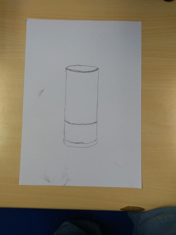
Blockouts
Soft Drink Can Blockout


Here I have created a blockout for my soft drink can in my scene, Here I have created a low poly version of the asset which I shall make the final model for in my development log, it took a bit of twitching here and there with scaling the edges around this object. Overall though I am pretty please with this asset, It started off as a cylinder but I have been able to mold the shape into a mesh that looks semi realistic for what I want the asset to look like. For my final product I will have the smooth the curves of the can a little more as well as create the effects on the top of the asset, the base as well would have to much more rounded so that the asset looks almost identical for my final scene.
Soft Drink Tall Can Blockout


Here I have created a low poly blockout for my second variant for my soft drink cans. Here I have focused a little more on making the bottom seem more curved and smoother so that the object could be stable and also look practical for someone to use it as if the asset was in real life. Overall I am quite happy with this blockout, however I feel that when it comes to create the final asset that would be used in my scene I would have to add more detail in the dip and the effects of the soft drink can to make this asset look the best it can possibly be.
Soft Drink Thin Can Blockout


Here i have the final variant to my soft drink selection of assets for my blockouts, Here I have tried to used my primary research as well as modeling basing off the detail of the asset as I used it while modeling this piece. I tried to add in the small dips and the effects it had to try and get the model as close as I could, I have tried to make the curves to the asset really smooth without adding to many polys to this asset as well as trying to keep the firmness of the material for this asset, overall this was quite easy to make but the scaling of the asset was quite complicated as I have to model this asset really large so that I could get as much accuracy as I could using the scale tool in Maya 2019 and then shrink it so that it was back to the center of my project file.
Milk Carton Blockout


Here I have my first blockout for my milk assets. This blockout is for my milk carton asset, overall this was a somewhat easy thing to model though it didn’t take me a few tries as beveling the edges at times messed with the vertexes making them stick out of the shape that I had to fix, This blockout is very good, I feel as if the sides of the large rectangle could be a little smoother and wider, as well as I feel as if the dips in the sides at the top of the asset could be smoother which is something I will have to work on when creating this asset as a final piece. Overall I’m quite please with this asset and I believe I can model this so it looks as realistic and as practical as I can make it.
Shotgun Shell Blockout


Here I have created a simple blockout for my shotgun shell asset. From creating this I have already developed a pretty sure way that I would be able to model this asset as well as I have been able to work a little bit of scaling between different aspects and components of this asset, for my final piece model I will however model my shotgun asset first and them model the shotgun shell so it is perfectly to scale with the weapon so that the shotgun shell fits in really well with my scene and I will also be sure to spend more time creating and adding detail to this asset so that I can give it the best possible look for my final scenes.
Shop Door Blockout


Here I have created a blockout for my shop door. Here I have followed my design from my sketches and I have used the Unreal Engine 4 man to help me make sure that my shop door is to scale. I have extruded and then beveled the door handle so that the handle is smooth so it not only looks realistic but also practical. I have been sire to handle the edges around my windows, however when I make my actual door to go into my scene I will curve and smooth this to give the effect of plaster holding the windows in place. I have also been sure to extrude outwards to create the door exterior which would be poking slightly out of the wall as this makes it realistic as well as allowing me to play with the scale of how thick I want the extrusion to be as well as how far I want it to extrude from the door.
Outside Shop Sign Blockout


Here I have created a blockout for my outside sign asset that will be placed into my scene. With making the blockout for this asset it allowed me to experiment with the scaling of many of the components of this asset. The first thing I started to make was the panel itself which was relatively easy. I then started to make the ajoining bar that holds this structure together, this was done with extrusions as well as beveling the curved edges to give me a smoother curve on both sides and then making sure the bar was equal length, though I did have to redo this piece a few times as I had to keep trying with the thickness of this bar. I Booleand the holes into the panel with cylinders as these represent the holes that will be needed so I can connect the panel to the chains in my final asset piece. for the chains I used rings as they helped me work out length between the pole as well as the panel as well as well as saving me time creating new chains. the base was quite tricky but after a few attempts I believe I have a method of creating this component that will be really useful when making this component for this asset later. Overall I’m quite pleased and I’m now confident when I make this asset, I can make it with a good level of detail and to a good standard.
Stop Sign Blockout


Here I have created my blockout for my stop sign asset, this assets was a very basic asset to make but I was able to add small details onto it. I was able to play around and get a good idea with the scale of the components to make up this asset, and to make this asset look good. I was able to get a good size for the depth of the sign as well as the thickness of the pole that the signs is bolted onto. I was able to make the effects of two screws going through the sign and were then held onto the pole by two bolts to make the assets look realistic as well as look practical. Overall from creating this blockout I have got a pretty good idea of what to do to model this asset as well as a good idea for scale and size.
Scene Layouts
Here I have drawn up a few different designs for the layout for my scenes, This will help me sort out where I will be placing my final assets in my scenes. This will help me with placing my assets after I have made them which will help me make sure that my scene is not to spaced out as well as not too compact to ruin the look and also the feeling of my scenes the scenes of course would differ within my two different scenes.
Scene Layout 1

Here I have my first layout design, here I have designed this so that the space in this building would not be to big or to small for all of my assets I have made the sidewalk quite thin as this would allow me to place my outside shop sign near the doorway as well as the road would only be part modeled as this would help me save space. I would make the original shop texture before it would be edited on so that I can have it pushed into Unreal engine and have the two different materials for the hop showing off the two different designs.
Scene Layout 2

Here I have my second layout for my final idea scene, with this design I have tried to make the shop not seem to closed off to the viewer in terms of feeling as if they were inside my scenes. I have made the starting of the building (from the road side) quite open spaced, the back of the shop slowly gets more cramped, the till as well as the shop counter on the right hand side of the building and then the shelves surrounding the cooler generator which would hold the cans of soft drink, a smaller section near the end as this would allow me to put all my variants on milk, another set of stalls near the window which would have all my tins on them the outside shop sign, sidewalk, and the section of the road has not changed in the slightest as they will be kept the same, needless to say the main pieces will of course stay the same in both of my scenes.
